Power BI and Data Analytics for Enviro’s (Nov 2020): Drowning in Data - Case Studies for the Water Industry
The "Power BI and Data Analytics for Enviros" meetup group is all about sharing tips, tricks and hacks for analysing, visualising and communicating environmental data. In the November 2020 session, we had three presentations showcasing how Power BI is being used across the water industry. The purpose of this blog is to summarise the key take-aways from each of the presenters, to help with sharing knowledge, empowering others and creating a strong data culture within our community.
You can watch the entire recording in the video above, or skip ahead to the sections that interest you by clicking on the individual videos below. The blog is connected to our Meetup group and YouTube channel recording, so we would LOVE to have you subscribe to these and become part of our growing community 😊.
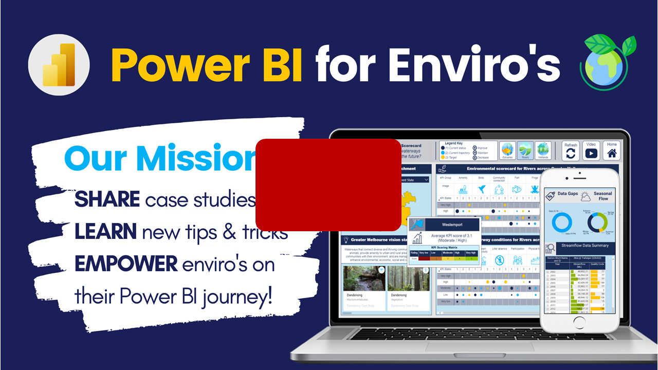
What this group is all about!
Christian Borovac & Alice Drummond (DiscoverEI)
Indigenous led AI in Kakadu
Justin Perry (CSIRO)
Justin Perry is a research scientist from the CSIRO, and presented on Indigenous led AI in the Kakadu National Park. Justin shared how the team are integrating Azure cognitive services with Power BI to support adaptive weed management in Kakadu, with a niche focus on collecting spatial imagery by using drones, interpreting percentage of area cover with AI technology, and communicating this information in a Power BI dashboard to help drive decision making. The project is part of a larger study being undertaken by CSIRO, with support from Microsoft, and you can read more about it in the articles below and GitHub:
Microsoft Story: https://news.microsoft.com/en-au/features/science-indigenous-knowledge-and-ai-weave-environmental-magic/
CSIRO article: https://blog.csiro.au/magpie-geese-return-ethical-ai-indigenous-knowledge/
GitHub: https://github.com/microsoft/HealthyCountryAI
My key summary points from the presentation included:
A key component of this project is about empowering the traditional owner communities across Kakadu in using the technology to help with data collection and interpretation.
The Healthy Country Partnership is using a combination of drone technology with artificial intelligence, and then harnessing and visualising this data through a Power BI dashboard.
The dashboard is being used as a decision support tool, to help inform which regions across the National Park are seeing the invasive species of para grass impact on the native Magpie Geese.
The dashboard uses the MapBox custom visual with the latest drone footage overlays to present a spatial view on what is happening across the region. If anyone is keen to explore MapBox further then take a look at the blog series here.
Water Accounting, Monitoring & QA Checks using Power BI
Douglas De Brito (Waikato Regional Council)
In this part of the video, Douglas De Brito from the Waikato Regional Council in New Zealand showed how he is using Power BI within the organisation. The key takeaways from this section are:
You can use a Power BI App within the online service for managing assets and water abstraction allowances.
Douglas showcased how he was using report page tooltips, bookmarks and buttons and cross-report drill-through, sync slicers between pages and awesome conditional formatting using colours and icons - if you want to learn these techniques then head across to our one-stop shop of the best Power BI resources here.
Douglas had set-up a mobile version of the Power BI report, which can be viewed by downloading the Power BI App on your phone (as shown below).
You can use Power Automate to set-up automated alerts for your dashboards based on trigger thresholds.
For more information on how to learn the wider Power Platform, Microsoft now run Virtual Training days for free - more information can be found here, and thanks a lot to Matt Burr for the tip!!
Water Corp Power BI Examples
Phillip Meng and Louise Holbrook (Water Corporation)
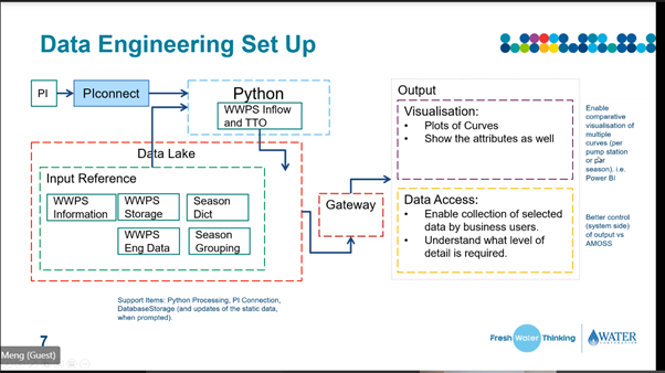
And lastly we had Phil and Louise from the Water Corporation in Perth, presenting three Power BI use cases within their organisation:
Bushfire Risk Assessment Tool
Water Treatment Plant Inflows / Outflows Report
Groundwater Abstraction Scheduling Report
Screenshots of the reports are presented further below, with the key take-aways from the session being:
The previous workflow for some of the Assessment Tools had a large reliance on Excel; however, due to some of the limitations with using Excel the team has gradually made the shift to using Power BI.
The bushfire risk assessment tool uses python in the back-end combined with spatial datasets, to help prioritise which sites are most at bushfire risk out of 30,000 potential locations across the state - historically prioritising the sites was completed using multiple spreadsheets and operator ‘gut instinct‘.
Power BI has been recognised internally as a fantastic decision support and risk assessment tool.
And thanks to Mim_Djo for helping me out with the summary of the session - I couldn’t have said it better myself:
Real life use cases for the industry
Workarounds on the 150k row excel export limit using VBAs
Aerial drone footage overlays in MapBox
And all about the tables for engineers 😁
Special ‘Christmas‘ Meetup Event #3
15 December 2020 (12:00 - 1:30 pm AEDT)
If you enjoyed this recording and our meetup sessions so far, then Register Today to join us next time as we present some of the best Power BI Custom Visuals available across the water and environmental industry.
We will have the following sessions coming to you from Canterbury (NZ), South Australia and from our own backyard in Victoria:
An Intro into the World of Custom Visuals to be presented by the custom visual developer extraordinaire himself Daniel Marsh-Patrick, who will provide a quick intro into the world of custom visuals, from no-code, to low-code to full blown development - he'll share the different options you have available and show you some of his very own visuals!
A session entitled Beyond "Click and Viz" by Kerry Kolosko. There is becoming an increasing reliance on DataViz to convey our information and data, but how do we make our Corporate coloured bar charts stand out from all the other Corporate coloured bar charts? Kerry will discuss and demonstrate creative uses of custom visuals to enhance visual communication, provide context to reports and engage audiences.
Alice Drummond will present on the Top 5 custom visuals that Enviro's need to know. As there are close to 300 Power BI custom visuals out there on the marketplace, it can get slightly overwhelming working out the best visualisation, but in this session Alice will share her top 5 for visualising environmental data, and walk through loads of demos on how to apply them!
We will also have our standard Networking, Q&A and "Ask the Enviro Experts panel" at the end to hear from the community on their favourite custom visuals!


Do you want to learn how to design engaging and intuitive Power BI reports, which communicate your key insights at a glance and tell your data story?
Our two-day Power BI training course is designed specifically for Power BI Professionals and Data Analysts, and provides our best practice tips, tricks and hacks to help you transform your data! We provide this course online, in-person group sessions, or customised in-house training for your team. Places are limited (max 8 participants per class) so secure your spot today!