

Flood Recovery Dashboard
DiscoverEI worked collaboratively with the NSW Department of Planning and Environment and the NSW EPA to create a public-facing online interactive Power BI dashboard for the ‘Flood Recovery Program for Water Quality Monitoring - East Coast Project’ study. The purpose of the dashboard is to assist the community in understanding the extent and duration of flood impacts on water quality and help inform decision making around waterway use following flood events.
Click on the button below to explore the dashboard!

Mid Murray Flows Interactive Web Map
DiscoverEI worked collaboratively with Charles Sturt University (CSU) to develop a customised interactive online visualisation tool to help communicate river and environmental flow data, and fish survey results across the Edward/Kolety-Wakool River system in southern New South Wales. We developed the tool using custom scripting and packaged into a WordPress plugin on the publicly available on the FLOW-Monitoring, evaluation and research (MER) website.
Click on the button below to explore the online web map!

Great Barrier Reef SELTMP Dashboards
DiscoverEI worked collaboratively with CSIRO to develop two interactive dashboards in Power BI to communicate the findings of the Social and Economic Long-Term Monitoring Program (SELTMP) to support managers and decision-makers within the Great Barrier Reef region to better understand the human dimension of the Reef, to help improve planning and management for the Reef’s future. The dashboard synthesises large-scale, time-series data about Reef users, communities, and industries, enabling new insights into their dependencies and relationship with the Reef, and how this is changing over time.
Click on the button below to explore the dashboards!

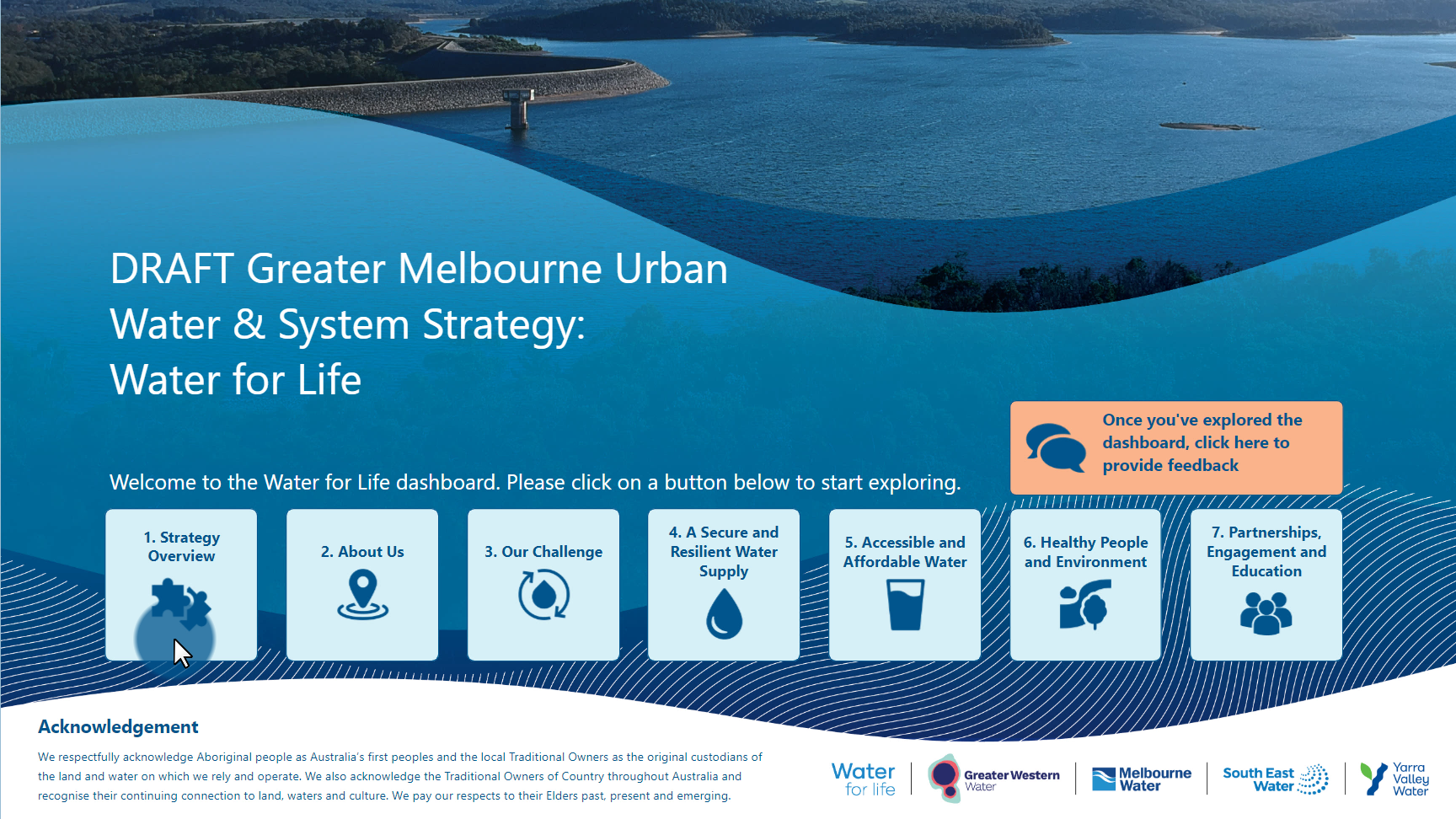
Water for Life Strategy Dashboard
DiscoverEI is proud to have worked together with the Greater Melbourne Water Corporations to create the Water for Life Strategy Dashboard, to help communicate their strategy to secure the water supply of Melburnian’s for the next 50 years. Through combining videos, interactive maps, infographics and dynamic narratives the team has unlocked the data to quickly create a shared understanding of the strategy to the general public so we can all have our say to help shape the future water supply of our great city!
Explore the dashboard for yourself today by clicking on the link below.
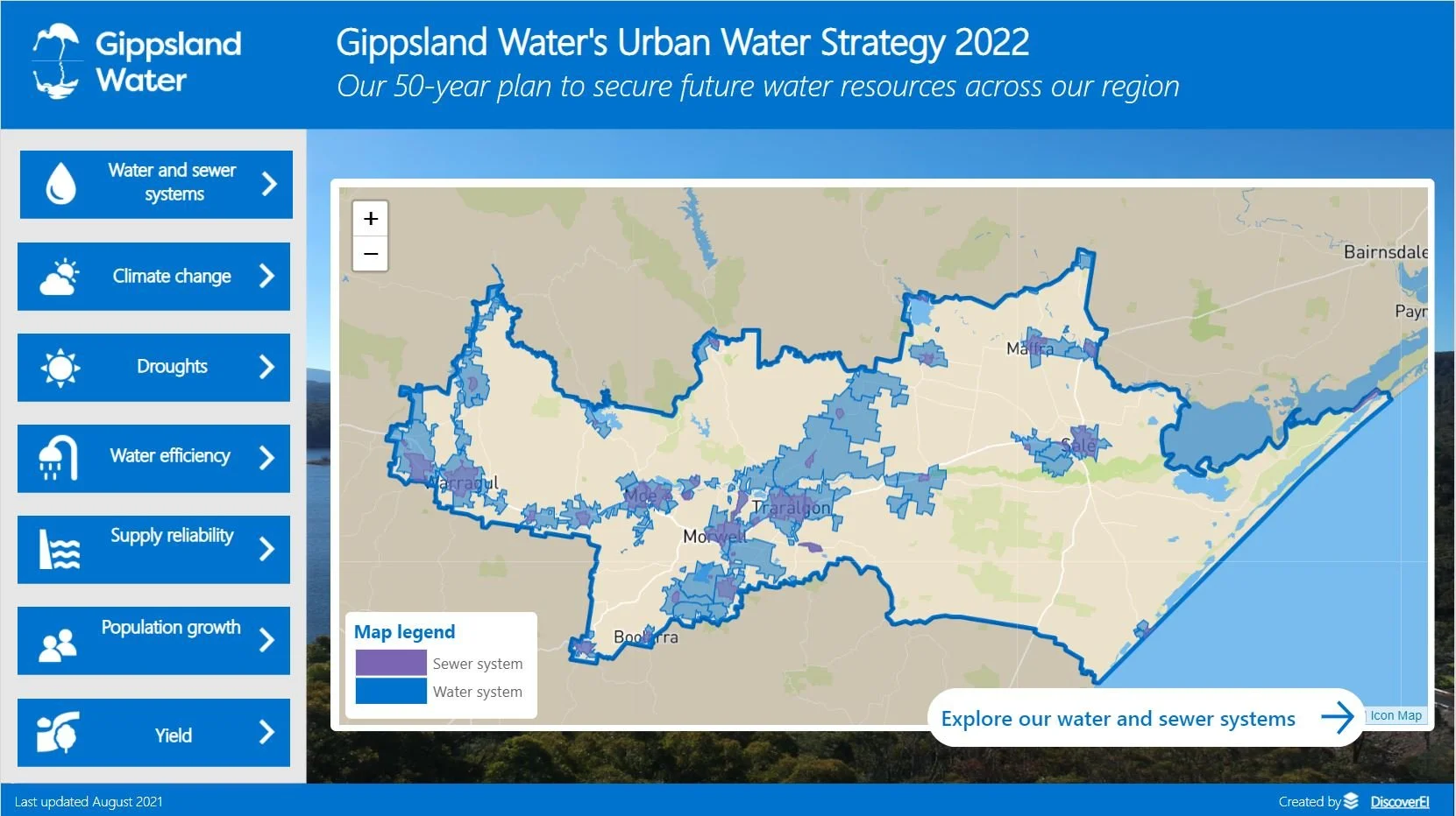
Gippsland Water Urban Water Strategy Dashboard
DiscoverEI is proud to have worked collaboratively with Gippsland Water to develop an interactive dashboard to help communicate the Gippsland Water Urban Water Strategy – their 50 year plan to secure future water resources across the region.
Click on the link below to explore the dashboard, including the interactive water and sewer maps, interactive infographics and photo galleries to learn more about where water comes from and where it goes across the Gippsland region.
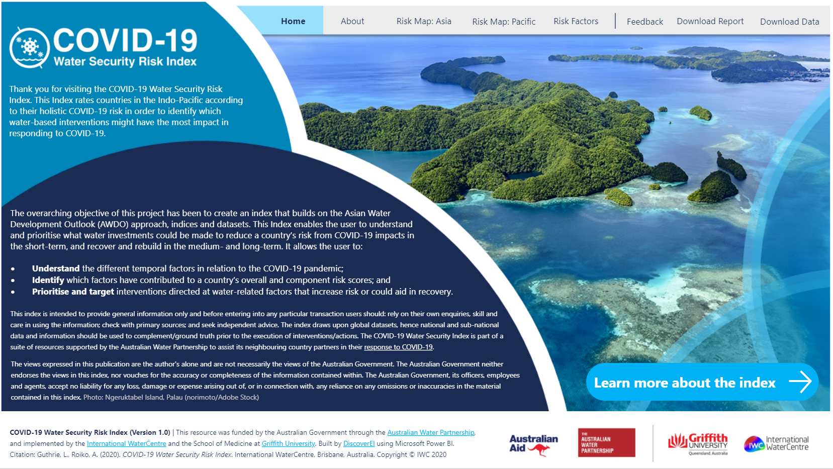
COVID-19 Water Security Risk Index Dashboard
The DiscoverEI team was proud to have worked alongside Griffith University, the International WaterCentre and the Australian Water Partnership, to develop this COVID-19 Water Security Risk Index Power BI report. This interactive decision support tool is enabling governments, communities and development organisations, to visualise the risks to water security, and prioritise response to assist those countries across the Indo-Pacific.
Click on the links below to interact with the tool via the International WaterCentre, or learn more about this initiative on the latest media release at Australian Water Partnerships website.
Environmental Flows Webtool for the Corangamite Catchment Management Authority
The DiscoverEI team developed a custom web application to visualise environmental and river flows across Corangamites catchments. By developing the tool in JavaScript we were able to customise the look and feel of the tool, and integrate environmental data from the Victorian Water Management Information System (WMIS) with local ‘on-premise’ data sources to provide near real-time reporting.
“The DiscoverEI team have been wonderful to work with. They are creative, hardworking and have a deep understanding of the water industry.”

Drawing insights from Stakeholder Engagement
This is a data visualisation Power BI example of analysing customer sentiment and values for key waterways across Melbourne, Australia. DiscoverEI has anonymised this data so that we can share it with the community! Check out this this short video to see how to navigate the Power BI report.
Head across to the Microsoft Data Stories Gallery to play around with the Power BI report for yourself!
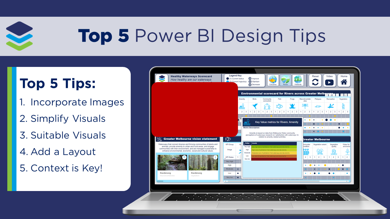
5 Tricks for Transforming Power BI Reports
The ultimate goal of any dashboard is to transform data into decisions. As analysts, it’s our job to make sure that not only the data is correct, but also that we visually communicate the key messages. In this video tutorial we’ll share our top 5 dashboard design tips to transform a pretty standard looking Power BI report into a more engaging and intuitive dashboard to help monitor the health of our rivers, wetlands and estuaries across Melbourne.
For more information, head across to our brand new blog #DataDiscoverEI, for weekly video tutorials covering all things Power BI, Graphic Design and the Environment!
Water Resource Management Dashboards
The water industry is literally drowning in data. At DiscoverEI we combine the latest business intelligence tools with computer animations facilitating a culture of data driven decision making across the water industry. Interactive dashboards are valuable decision support and communication tools, presenting a large volume of information in an accessible format to facilitate stakeholder engagement.
In this short video, we present a range of case studies where interactive dashboards have been applied across the water industry, to streamline data processing and create a shared understanding of our complex water systems to help secure a more sustainable future water supply.

Groundwater Quality Dashboard
At DiscoverEI we love transforming lengthy static reports into interactive dashboards to enable real-time reporting and on-going management of our environmental systems.
In this short video we explore some of the key features of our latest groundwater quality compliance reporting dashboard, which is a fantastic tool for communicating water quality trends, statistics and exceedances. We present the DiscoverEI geological bore log, which is an example of one of the Power BI custom visuals which our team has created to help visualise and communicate environmental data.

Water Supply Management Dashboard
DiscoverEI, in collaboration with Central Highlands Water developed an interactive dashboard and reporting tool within Microsoft Power BI to help manage water resources within the Daylesford region. We combine climate, streamflow, storage, groundwater, demand and forecast data to create a holistic decision support tool providing a snapshot of system performance and help guide operation.
This short video explores some of the key features of this dashboard, and demonstrates how we use dashboards to transform environmental data into decisions.

Animating Australian Catchments
In 2019, we’ve just experienced another record breaking Australian summer, with January to April being the warmest period on record. DiscoverEI have been busy capturing these impacts on our water systems, combining aerial drone footage with animations and infographics to help our clients visualise and communicate their complex environmental systems.
Take a look at one of our case studies we’ve prepared for the major reservoirs within the Werribee system in Victoria.
Water Resource Modelling
DiscoverEI, in partnership with GHD developed a hydrological model of the Otway Water Supply System for Wannon Water. We developed a flexible water supply model within eWater Source which can be used as an ongoing decision support tool.
As part of this study we also created a series of ‘how-to’ videos demonstrating how to maintain, update and simulate the Otway Source Model, empowering Wannon Water to use this model as an in-house predictive tool beyond the life of this study.

Victorian WMIS Streamflow Dashboard
Discover how we apply the latest Business Intelligence tools within the environmental industry to process, analyse and visualise your environmental data through interactive dashboards and mobile apps to tell your data story.
Check out this short video where we showcase how we can easily extract data insights from over 7,000,000 rows of historical streamflow data from the Victorian Water Management Information System (DELWP, 2019) which can help our water authorities manage our future water resources.

DiscoverEI’s Environmental Field Collector Mobile App
Access your data on the go. DiscoverEI creates custom mobile apps tailored to meet our clients unique project needs. Whether it’s collecting environmental field data, managing project teams, or accessing information on the go, we work with our clients to develop flexible low-code mobile applications to fit even the smallest project budget!
Check out this example of an environmental field data collection app which DiscoverEI created to help environmental field staff to enter data on the go, and automatically syncs to your systems back in the office to avoid double handling data, freeing up your time for the important things!
The possibilities are endless…

Mobile Dashboards
Discover how we combine the latest Business Intelligence tools with mobile apps within the environmental industry so that you can access your data anywhere, anytime. Whether it’s access to real-time data from environmental field sensors or configuring mobile alerts to notify you when your data exceeds predefined limits, the possibilities are endless.
Check out this example of how DiscoverEI configured a mobile app which can help our water authorities and environmental managers access over 7,000,000 rows of historical streamflow data from the Victorian Water Management Information System (DELWP, 2019) in the palm of their hands!
