
Power BI and Data Analytics for Enviro’s (Dec 2020): All About Power BI Custom Visuals

🎦 Check out the full event recording here 🎦
The "Power BI and Data Analytics for Enviros" meetup group is all about sharing tips, tricks and hacks for analysing, visualising and communicating environmental data. In the December 2020 session, we had three presentations focused on the World of Power BI Custom Visuals, and how these can be applied to visualise environment and water data. The purpose of this blog is to summarise the key take-aways from each of the presenters, to help with sharing knowledge, empowering others and creating a strong data culture within our community.
You can watch the entire recording in the video above, or skip ahead to the sections that interest you by clicking on the individual videos below. The blog is connected to our Meetup group and YouTube channel recording, so we would LOVE to have you subscribe to these and become part of our growing community 😊.
What’s New…
Christian Borovac & Alice Drummond (DiscoverEI)
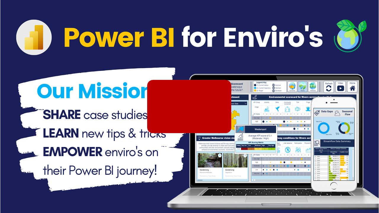
▶️ Listen to Alice and Christian introduce the group and share what our mission is all about ▶️
The DiscoverEI team are excited to be on the lookout for a new intermediate level analyst, to start in 2021. We want a passionate and enthusiastic Power BI developer, with a general understanding of environmental and water data, and is willing to work with a small and growing team!
More details on the role are presented in the image on the right, but if you think this could be you, then send through your CV to info@discoverei.com.

Intro to the World of Custom Visuals
Daniel Marsh-Patrick (Coacervo | DiscoverEI)

▶️ Skip ahead to Daniel’s session ▶️
Daniel Marsh-Patrick is a Microsoft MVP for the Data Platform based out of Christchurch NZ, who has a passion for developing Power BI custom visuals. He regularly presents and blogs on a variety of Power BI subjects and is the creator of THREE custom visuals on the Microsoft Marketplace (Small Multiple Line Chart, Violin Plot and HTML Content), and one custom visuals on the DiscoverEI Marketplace (Geological Borelog).
He has recently completed recording of his very own RADACAD Custom Visual Training Course, which takes you step-by-step how to build your own visuals. There are more than 300 custom visuals available in the Power BI Marketplace at the moment; however, sometimes you need greater flexibility in the way you want to visualise your data. The course is available for purchase HERE.
My key summary points from the presentation included:
The Charticulator custom visual is a low-code approach for creating your own custom visuals for your Power BI report - it can be accessed through: https://charticulator.com/
A certified custom visual is represented by a blue star, whereas an uncertified visual has a green star - there are a range of advantages and disadvantages based on the type of visual you’re using and you can find out more about certified visuals here: https://docs.microsoft.com/en-us/power-bi/developer/visuals/power-bi-custom-visuals-certified
Daniel is currently building an exciting new custom visual named Deneb, which will allow users to use Vega (Visualisation Grammar) to present their data.


Top 5 custom visuals that Enviro's need to know
Alice Drummond (DiscoverEI)

▶️ Skip ahead in the video to see Alice’s session ▶️
In this part of the recording, Alice showed off how to use her 5 favourite custom visuals for environmental data. These visuals included:
Icon Map: A powerful spatial mapping visual to show polygons, polylines and points in one view.
Image by Cloudscope: A great custom visual to show dynamic images of all sizes
Card Browser: A photo gallery visual very useful for showing qualitative and text information combined with images.
Synoptic Panel: A dynamic interactive visual which combines data with graphic design
HTML Content: An all-powerful visual that can be leveraged if you understand HTML, from presenting rich text formatting, embedded videos and motion graphic animations.
Beyond "Click and Viz"
Kerry Kolosko

▶️ Skip ahead in the video to see Kerry’s session ▶️
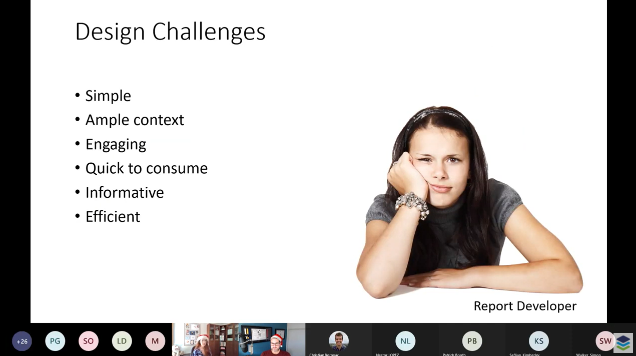
And lastly Kerry is an experienced data analyst, who specialises in Power BI. She loves to bring her studies in psychology and human perception, passion for arts and general geekiness to create tailored reporting for executive audiences.. In this session Kerry showed us some clever UI/UX techniques for overcoming many of the Power BI report design challenges that we face. The key take-aways from her session included:
How to structure the report page to direct people’s attention to the most important features first
Using a traffic light approach combined with clever iconography is a great way to present environmental or sustainable scorecards.
Know your audience, and don’t overwhelm the users with too much information - white space allows your visuals to breathe!
Some of Kerry’s awesome Power BI reports are available for viewing and interaction on the Data Stories Gallery. You can find them:

Have a Safe, Happy and Healthy Holiday Period

We will be returning on 28th January 2021 with a Mapping Masterclass - more information on the session is available through the following link!!
If you enjoyed this recording and our meetup sessions so far, then Register Today to join us next time as we present some of the best Power BI Custom Visuals available across the water and environmental industry.

We are excited for the January 2021 Mapping Masterclass session, which will feature three speakers discussing different options for visualising spatial data:
Getting started with the Icon Map: Alice Drummond (~ 25 mins)
The Icon Map is a powerful mapping visual that allows us to display points, polylines and polygons altogether - by leveraging the MapBox custom tilesets we can provide really rich spatial context to our data - Alice will take us through getting started with the Icon Map, and answer your questions on how best to apply it!Mapbox API’s: Idris Syed (~25 mins):
Idris will guide us through the Mapbox API, and show how you can automate your spatial dataflow using this feature.Developing interactive maps using Carto: Chandni Gupta (~ 25 mins)
Chandni will take us through how to develop interactive maps with Carto, using a customised Mapbox basemap. She'll also show how we can then embed these maps into our websites to share with a wider audience. If you want to learn more about the session, here is a link to a map Chandni recently developed using Carto: https://chandnig.carto.com/builder/36a1d168-a907-4326-95fa-31b5c95b95ad/embedQ&A: There will be an opportunity for 5 minutes' worth of questions for each presenter at the end of their sessions, and an additional 15 minutes at the end (if time allows).
Power BI Training Courses
If you’re interested in learning from our team, then we have a range of 2-day Power BI training courses available to fast-track your Power BI journey.
Click on the links below to learn more, and get in touch with the team today!
Purchase Training


Do you want to learn how to design engaging and intuitive Power BI reports, which communicate your key insights at a glance and tell your data story?
Our two-day Power BI training course is designed specifically for Power BI Professionals and Data Analysts, and provides our best practice tips, tricks and hacks to help you transform your data! We provide this course online, in-person group sessions, or customised in-house training for your team. Places are limited (max 8 participants per class) so secure your spot today!