
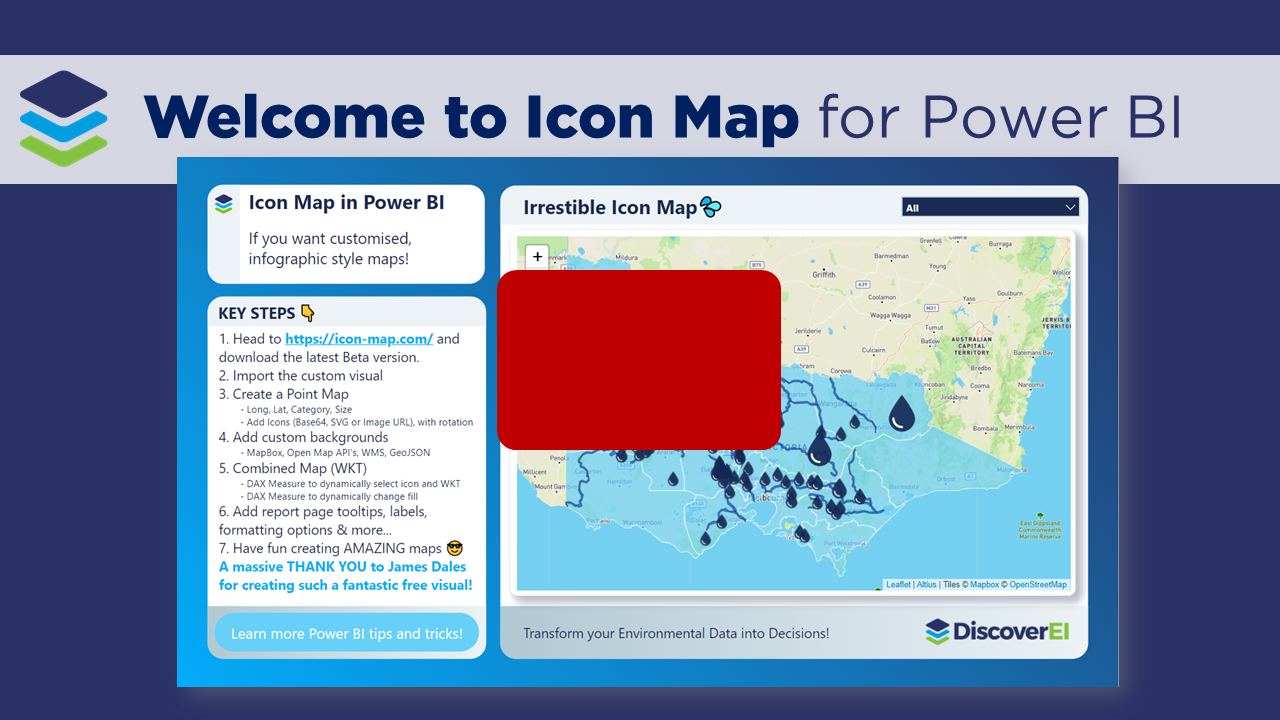
Welcome to Icon Map for Power BI
Working across the environmental industry – it’s fair to say that pretty much ALL of DiscoverEI’s Power BI reports have a map! And if you thought that MapBox was good, well you’re going to LOVE the Icon Map custom visual in Power BI – which allows you to display interactive polygons, points, lines and of course – icons, all in the one visual…plus so much more!
We’ve been using the Icon Map custom visual in Power BI for the last couple of years and it’s safe to say that it is hands down our favourite mapping visual for Power BI! This visual is created for free for the community by James Dales. James is always making updates and enhancements to the visual so the best place to get the latest version and some helpful instructions and tips on how to use it is from his dedicated website: https://icon-map.com/index.html. And while you’re there remember to shout James a coffee or 10 to say thanks for creating such a fantastic mapping visual 😀
To really appreciate how Icon Map can be used to visualize real world data, in this video blog I walk through two of DiscoverEI’s real-world project applications of Icon Map to visualize environmental data. Click on the links below to check out Icon Map in the Power BI reports for yourself:
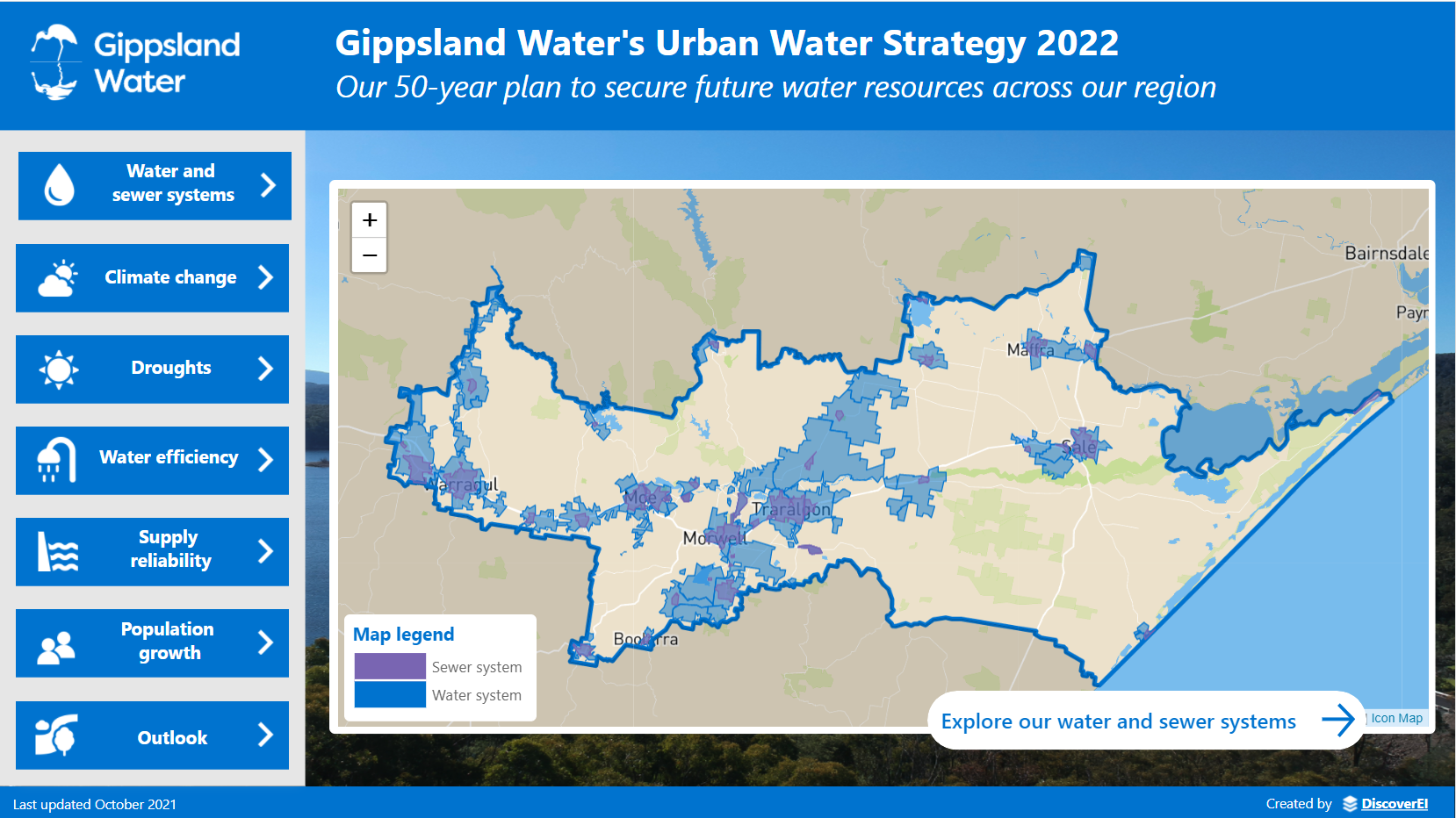
Gippsland Water’s Urban Water Strategy: Click on the image to see how Icon Map was used to create detailed maps of Gippsland Water’s water and sewage network.

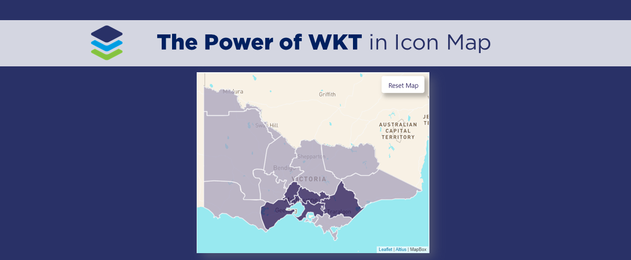
Victorian Water Grid dashboards: Click on the image to see how Icon Map was used to create several ‘infographic‘ style maps to visualise urban, rural and environmental water across Victoria.
🎦 Watch the video blog here 🎦
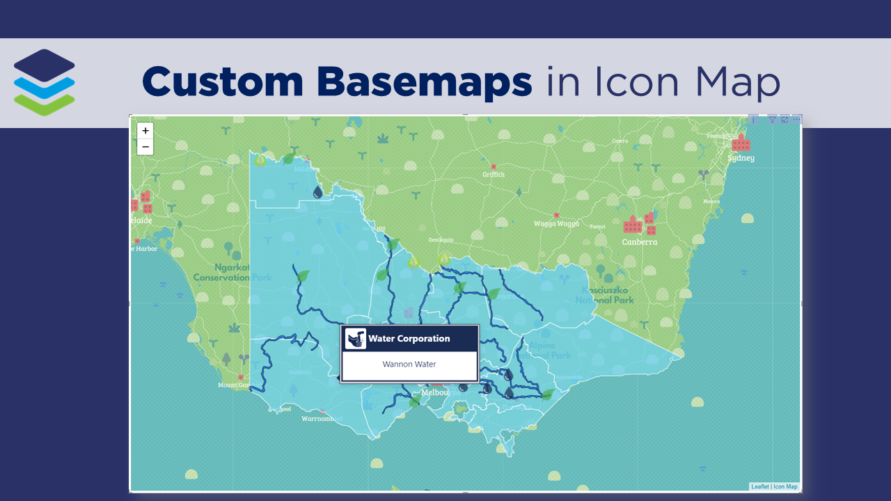
If you’re keen to learn more about how you can create your own Icon Maps in Power BI, then be sure to check out our future video blogs where we’ll be exploring real-world applications, creating a simple Icon Map, creating an icon Map using custom WKT and integrating MapBox and Icon Map to design custom base-maps.
Have fun creating your own Icon Maps and thanks for watching!
Power BI Training Courses
If you’re interested in learning from our team, then we have a range of 2-day Power BI training courses available to fast-track your Power BI journey.
Click on the links below to learn more, and get in touch with the team today!
Purchase Training


Do you want to learn how to design engaging and intuitive Power BI reports, which communicate your key insights at a glance and tell your data story?
Our two-day Power BI training course is designed specifically for Power BI Professionals and Data Analysts, and provides our best practice tips, tricks and hacks to help you transform your data! We provide this course online, in-person group sessions, or customised in-house training for your team. Places are limited (max 8 participants per class) so secure your spot today!